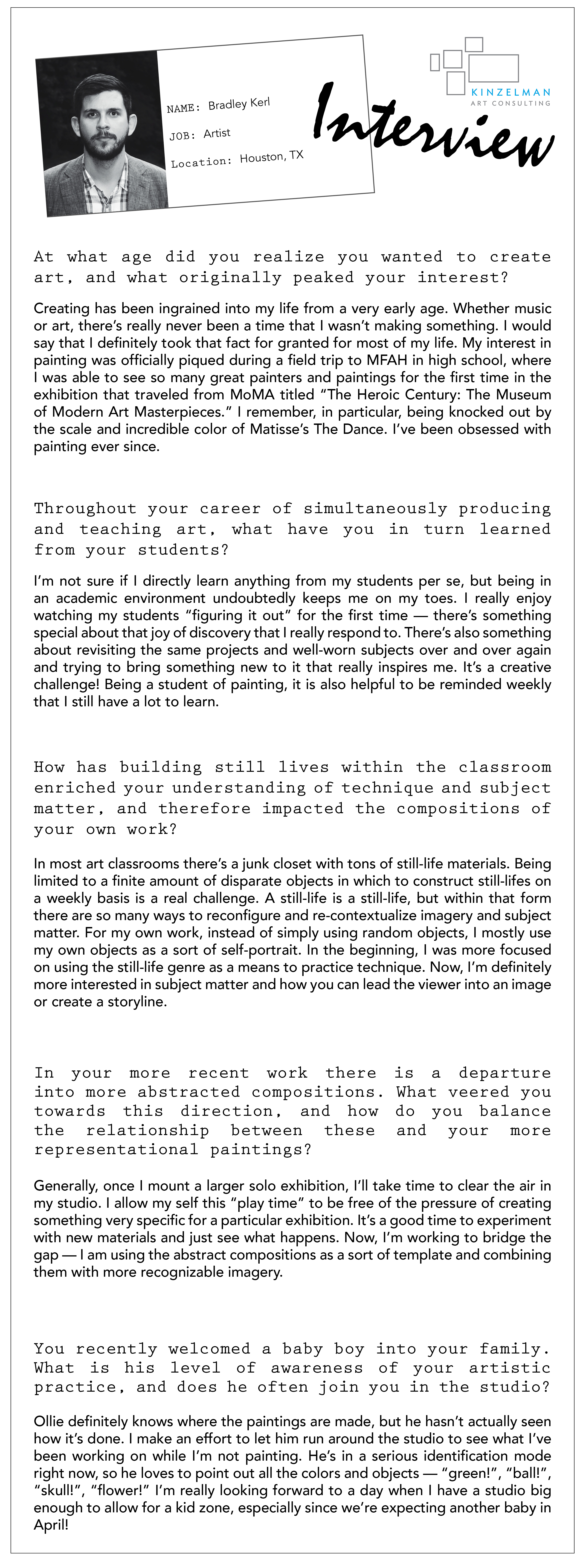
In KAC’s latest Interview, Houston-based painter and professor Bradley Kerl shares an inside look into what originally focused his creative journey towards painting, where his body of work is headed and exciting news about his growing family.
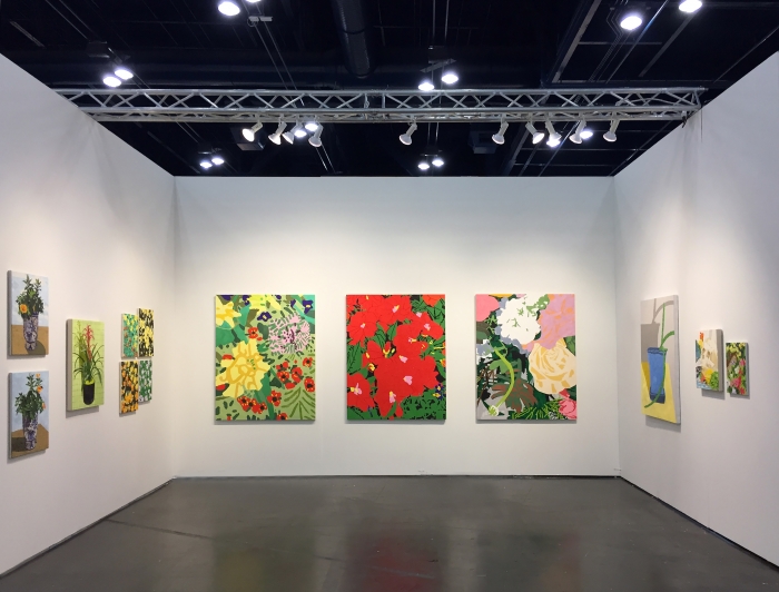
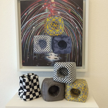
Kerl's work at Texas Contemporary Art Fair, 2016.
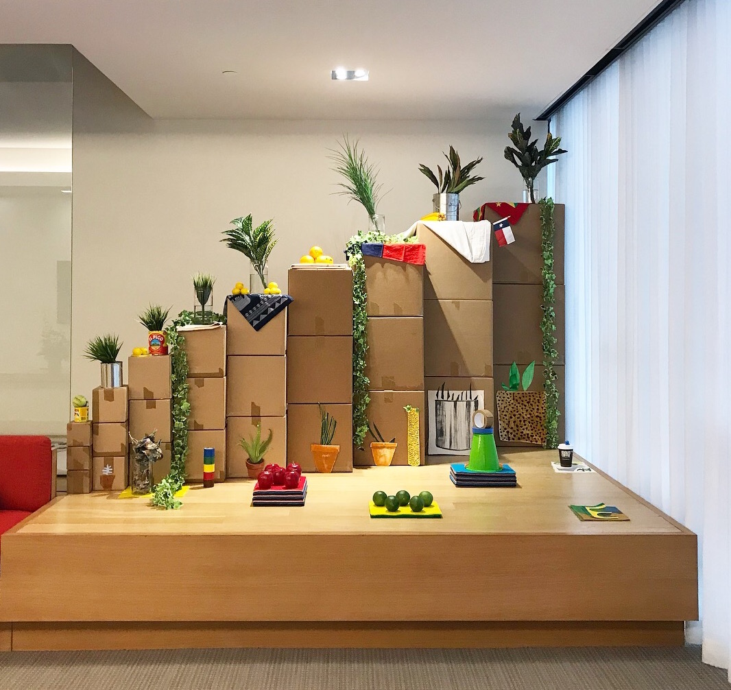
Kerl's site-specific still life set at Gensler, Houston.
KAC announces a solo exhibition with Houston artist Hillevi Baar on view at Gensler Houston. The inspired creator of intricate installation-based works, Baar views herself as not only an artist but also as a facilitator who assists her medium of Mylar to reside in it's intended and natural state. Her active interplay with medium explores variations in form, often derived from interactions observed between wind, water, plant life and shadow play.
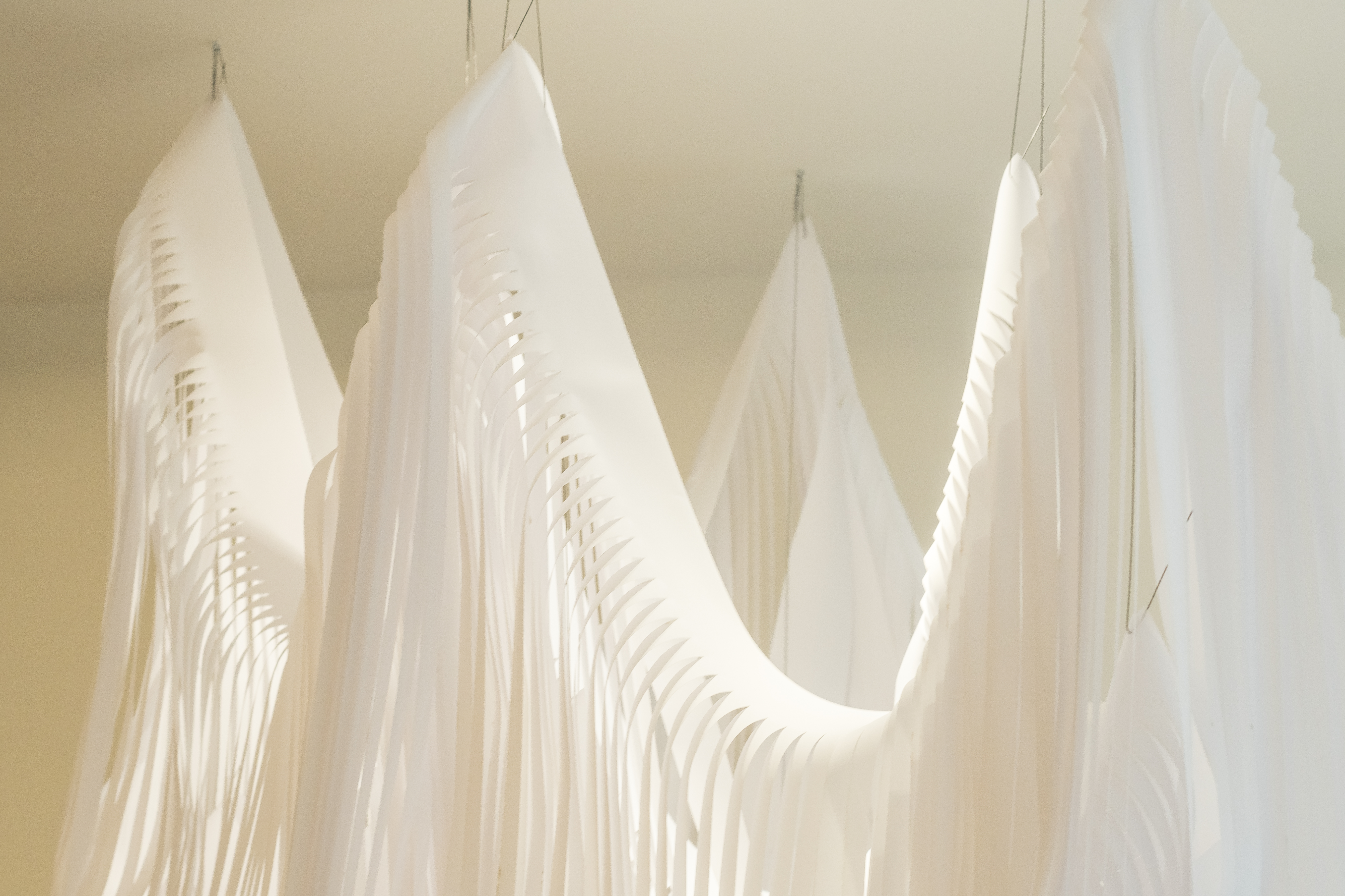
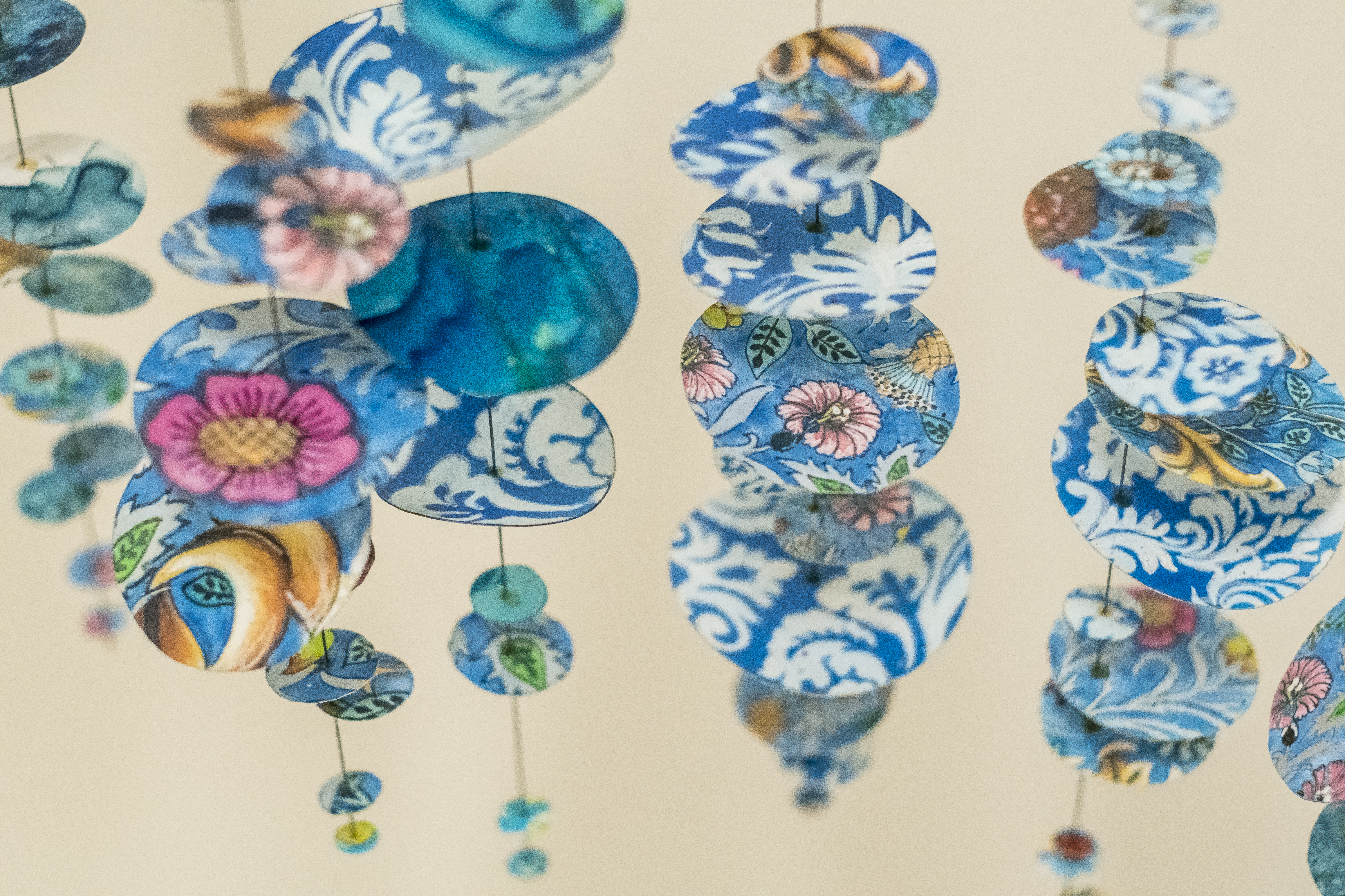
"Float" by Baar in Gensler's reception
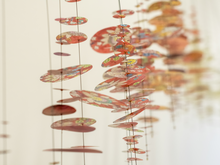
Baar’s experimentation with Mylar is particularly evident in "Float," a site-specific installation created for Gensler’s reception. This elegant suspended sculpture investigates the balance between meticulous strategizing and spontaneous on-site manipulation in response to the environment. Baar began creating this piece by carefully scoring the Mylar to intentionally mimic the linear forms throughout Gensler’s space.
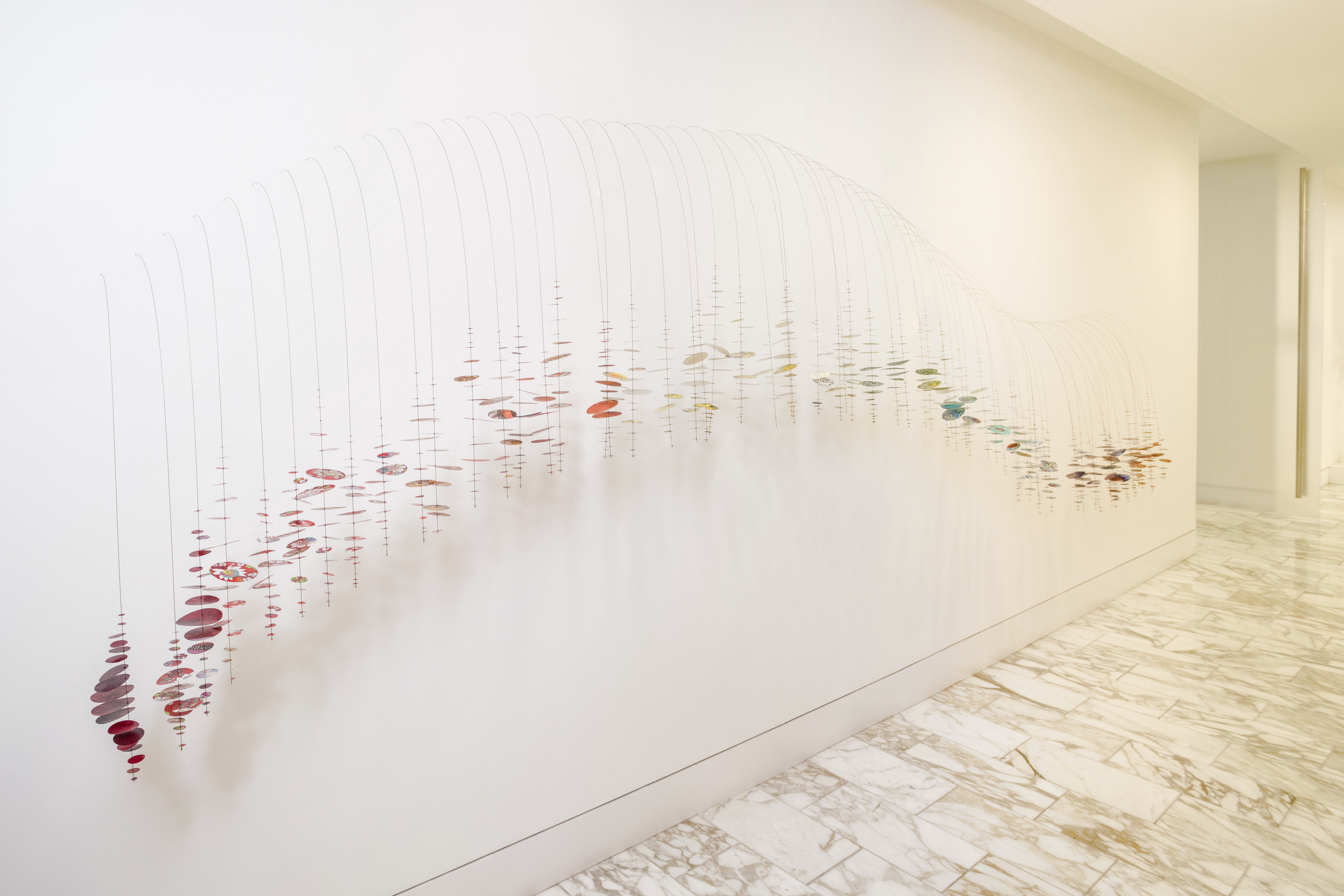
"Wild Flowers" by Baar in Gensler's Conference Corridor
References to nature are also seen in "Wild Flowers," a wave-like form installed along Gensler's Conference Corridor comprised of Mylar and steel pins resembling delicate branches. These complex elements seem to grow from the wall, fusing into one fluid shape that gently sways with the flow of foot traffic. These slight movements expose individualized drawings hidden between the intricate layers.
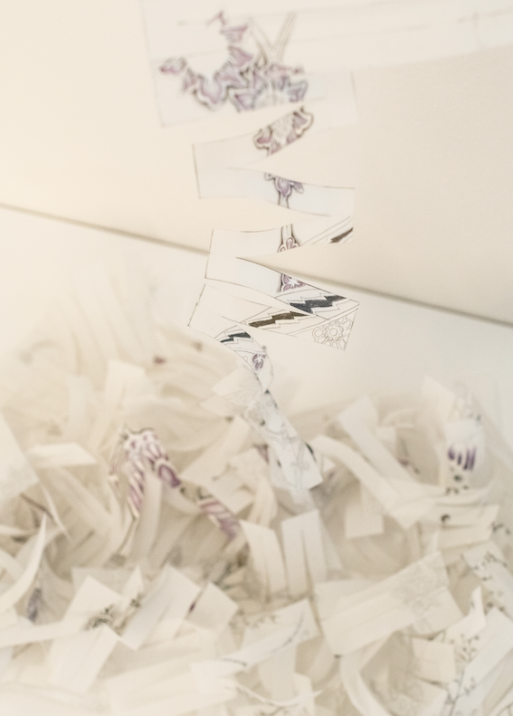
This interactive component allows the viewer to experience the piece in its entirety, while also inviting the study of each self-contained drawing. Conversely, "Unraveled" in the Coffee Corridor beckons the viewer to quietly approach the finely cut and tapering suspended Mylar sheet to fully experience the highly detailed graphite drawings within.
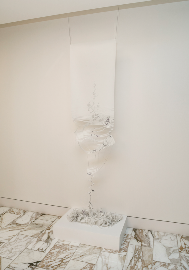
"Unraveled" by Baar in Gensler's Coffee Corridor
Baar is continuously experimenting with the dimensionality and boundaries of medium to transform the environments of numerous corporate and private spaces. This exhibition was curated by Kinzelman Art Consulting on behalf of Gensler.
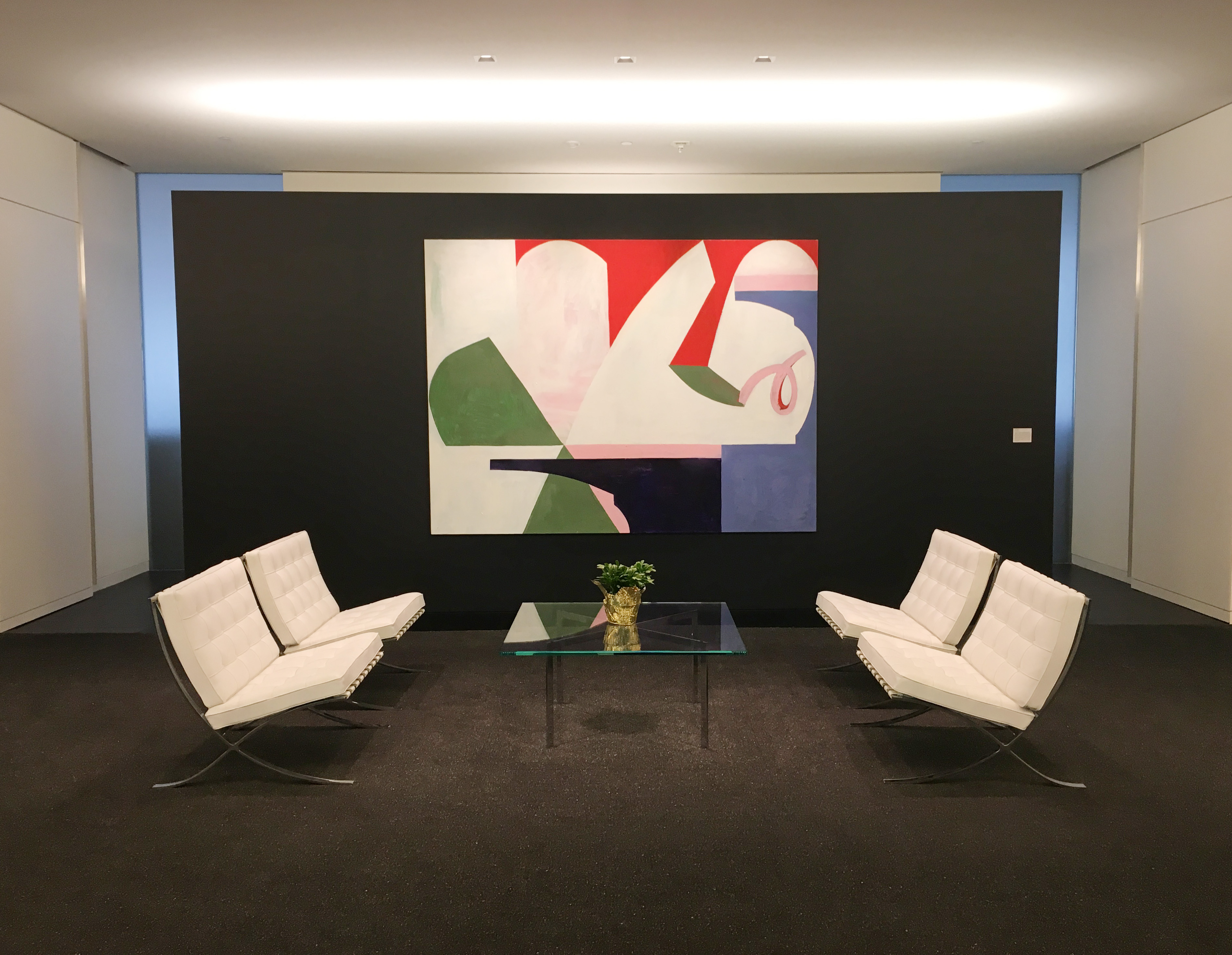
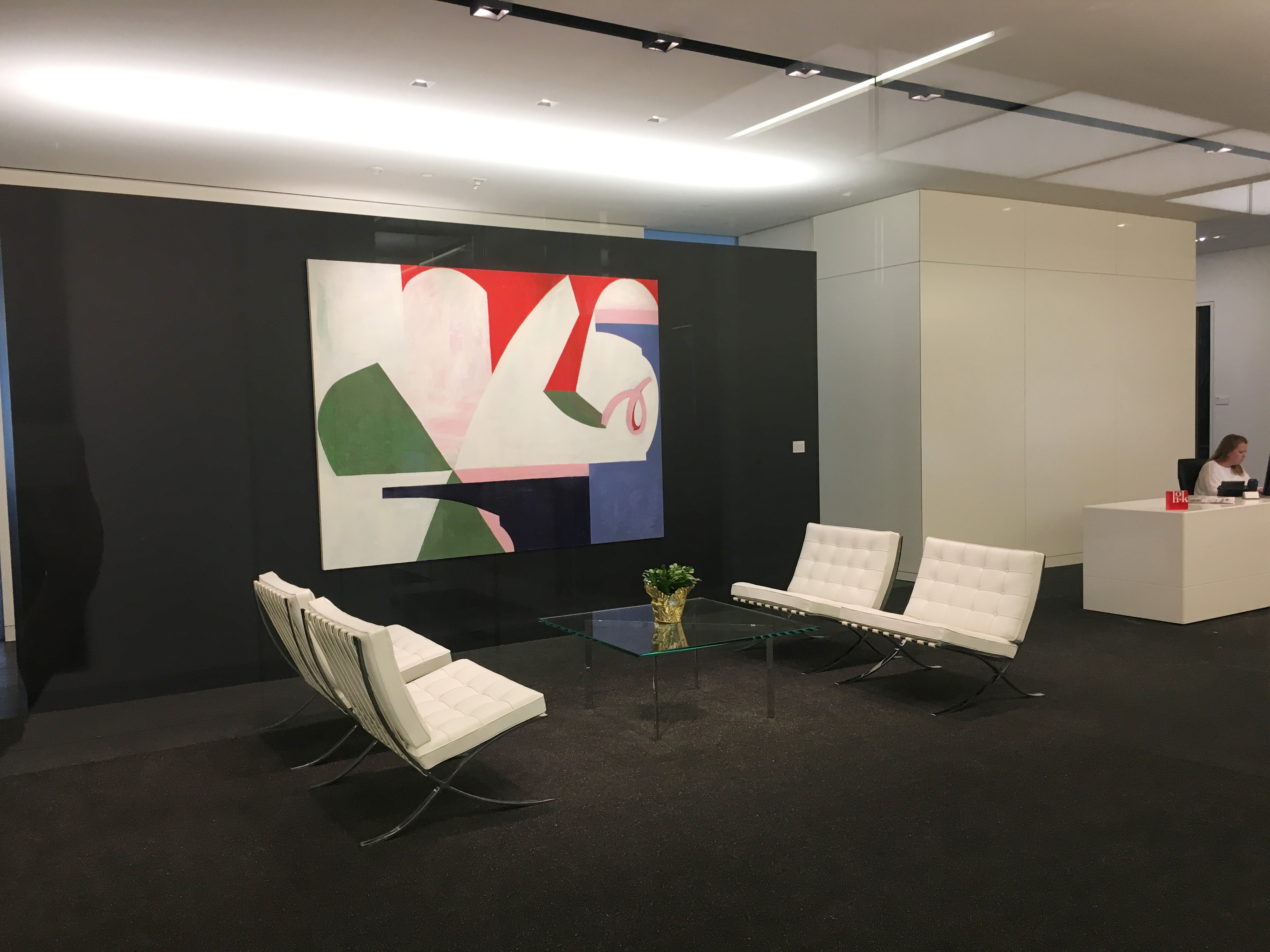
As part of our biannual art rotation on HOK Architect's striking black signature wall, we are pleased to present David Aylsworth's dynamic painting titled Miss Farrah Fawcett from TV (for Ethan). Aylsworth's work is also being shown currently in Inman Gallery's newest exhibition: David Aylsworth: Sweet sweet sweet sweet sweet tea which opens January 8th and runs through February 20th. We are excited to support the expert work of Houston's own David Aylsworth.
For Aylsworth, the action of painting is an intuitive process of discovery where the objective of perfection and precision is left behind. His paintings are laboriously constructed of innumerable layers of textured paint, often in shades of white, and vibrant shapes that infer depth and vitality. While most of Aylsworth’s works are titled with and inspired by lyrics from musicals, Miss Farrah Fawcett from TV (for Ethan) is based on a drawing by his young nephew. Regardless of his muse, the paintings are always created from a place of exploration and authenticity.
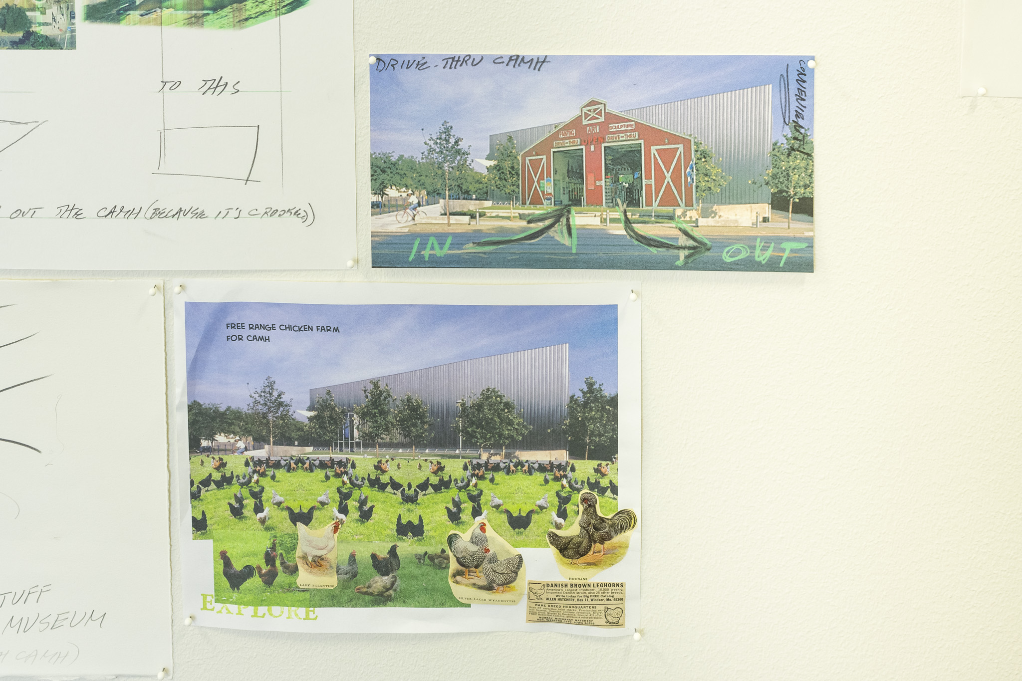
As part of our quarterly art rotations at Gensler Architecture’s offices in downtown Houston, we asked The Art Guys to take over Gensler’s space. The duo gladly curated a selection of works for the reception and corridors that explore architecture, urban planning, and engineering. The Art Guys, Jack Massing and Michael Galbreth, have been injecting humor and wackiness into the art world for over 30 years.
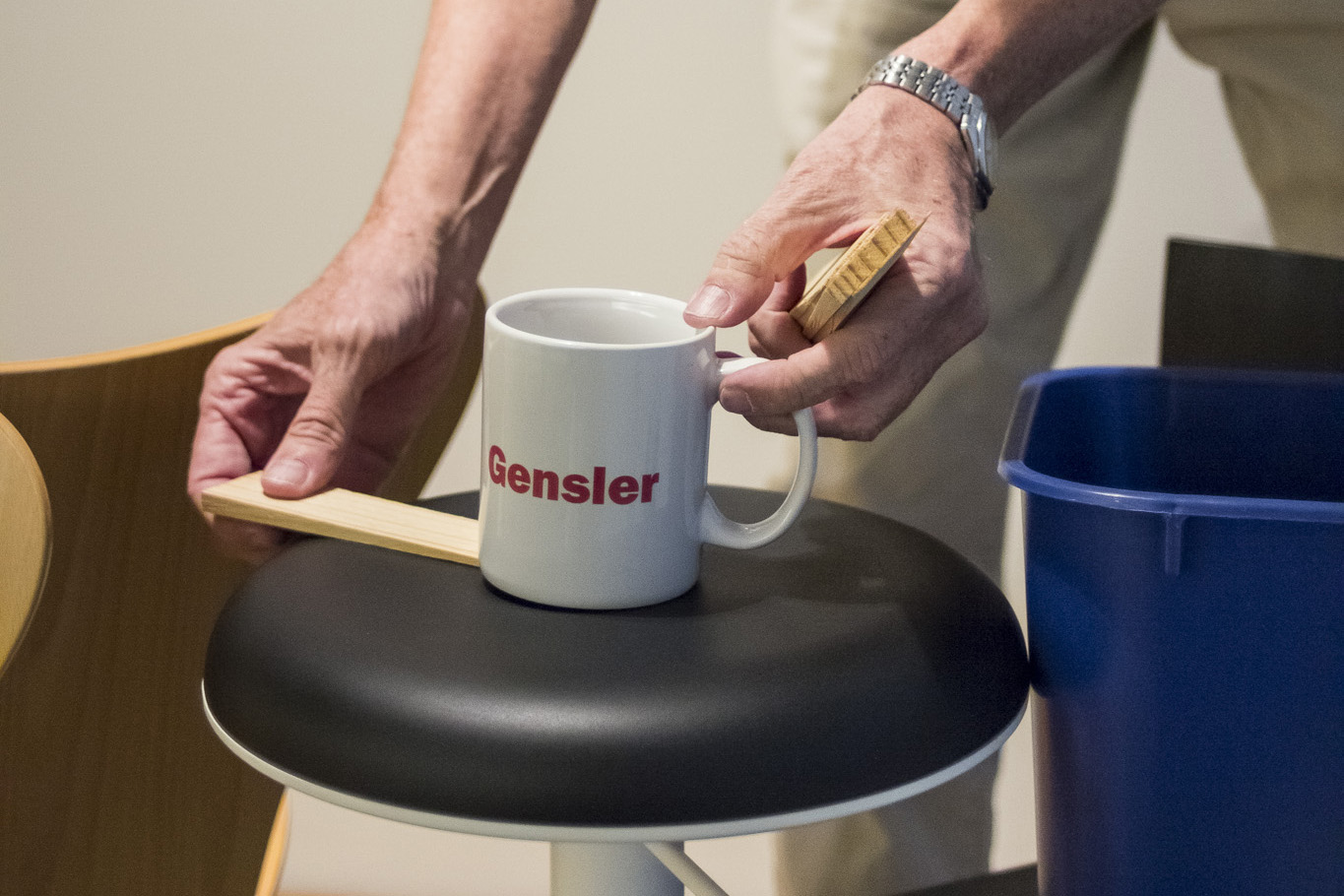
This show, The Art Guys: Some Conceptions, digs into their rich archive of work to spark a conversation tailored to Gensler’s industry. The show includes an installation of found office objects that are grouped and shimmed (literally inserting wooden wedges under the objects), a large skyscraper sculpture made entirely of pencils, a series of the 101 of the World’s Greatest Sculpture Proposals, and an expansive salon of Art Guys drawings, sketches, and doodles of projects concepts. The exhibition as a whole is a testament to how The Art Guys expertly present complex concepts with lightness and humor.
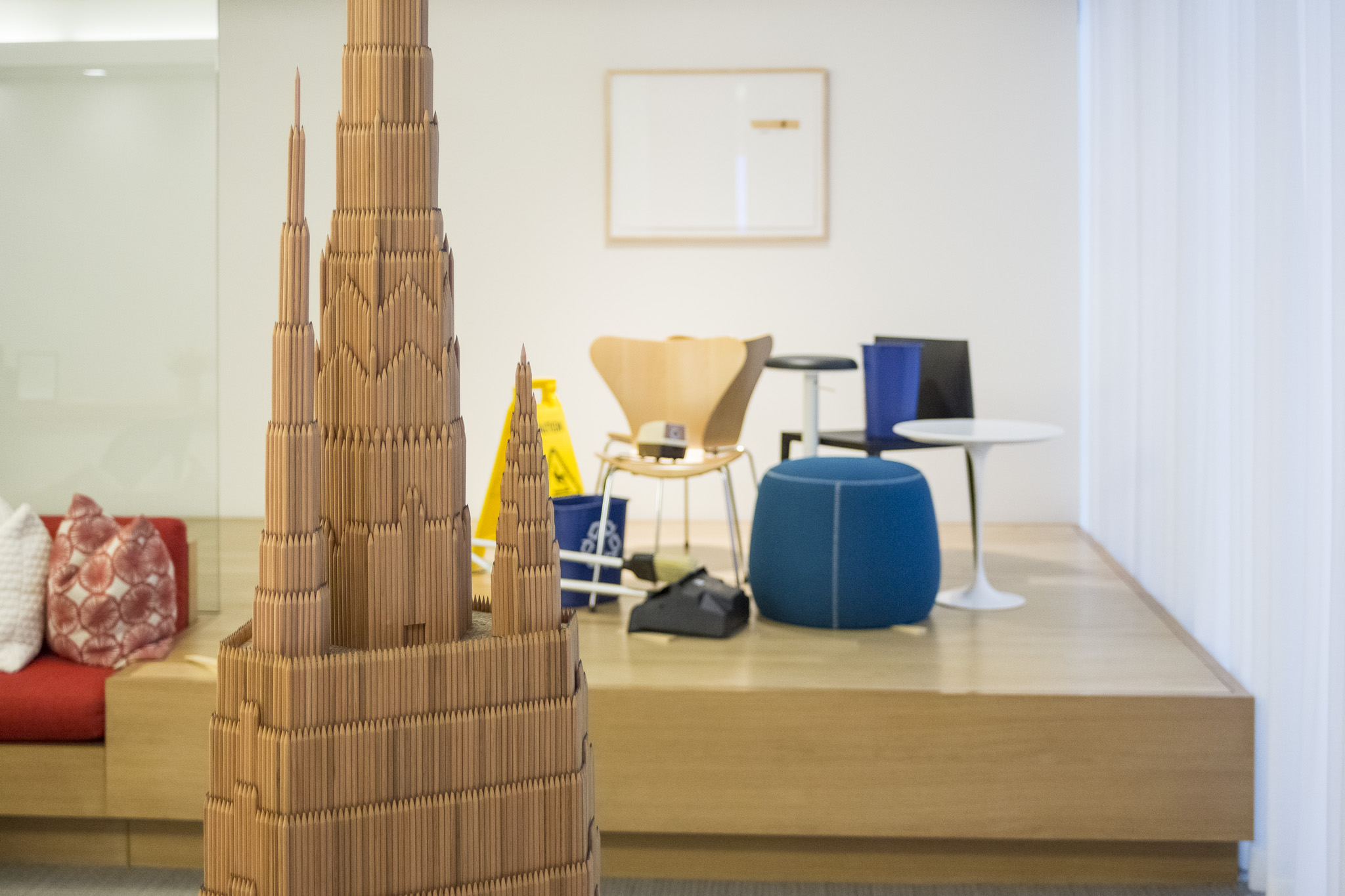
While installing the main reception display of shimmed objects, Michael explained the importance of improvisation to their work: “I prefer to make the entire show on site. It's more fun and becomes more of a truly experimental thing.” True to this process, he gathered random office supplies, arranged, and shimmed them completely on the fly - stacking a pencil sharpener on chair or unrolling a roll of toilette paper then shimming one side or the other. The shim to The Art Guys is “the perfect sculpture. … The funny thing is that it destabilizes everything. Instead of making it sturdy, you make it teeter, which is our mythology.”
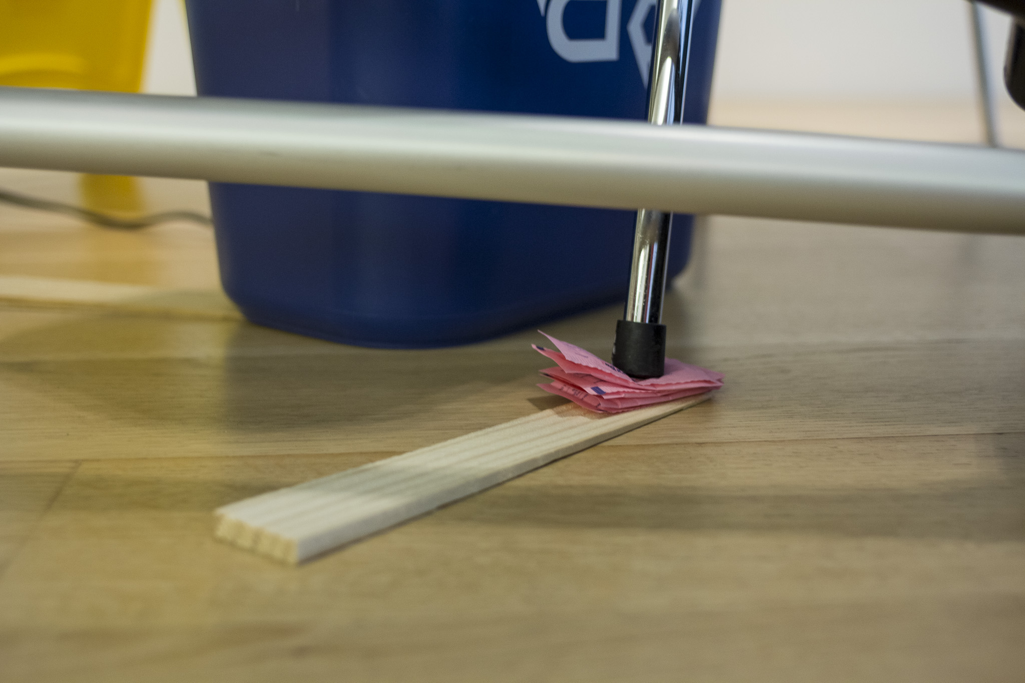
The other works in the show follow this philosophy of destabilization as well. The pencil skyscraper, Bonded Activity #55 Skyscraper, transforms the grand form of something large and looming into its origin, the humble pencil, the design and form of which is less famous but equally or arguably more significant. They revisit this idea of the “architecture of material” in other sculptures using bottles, pills, or food as their building blocks.
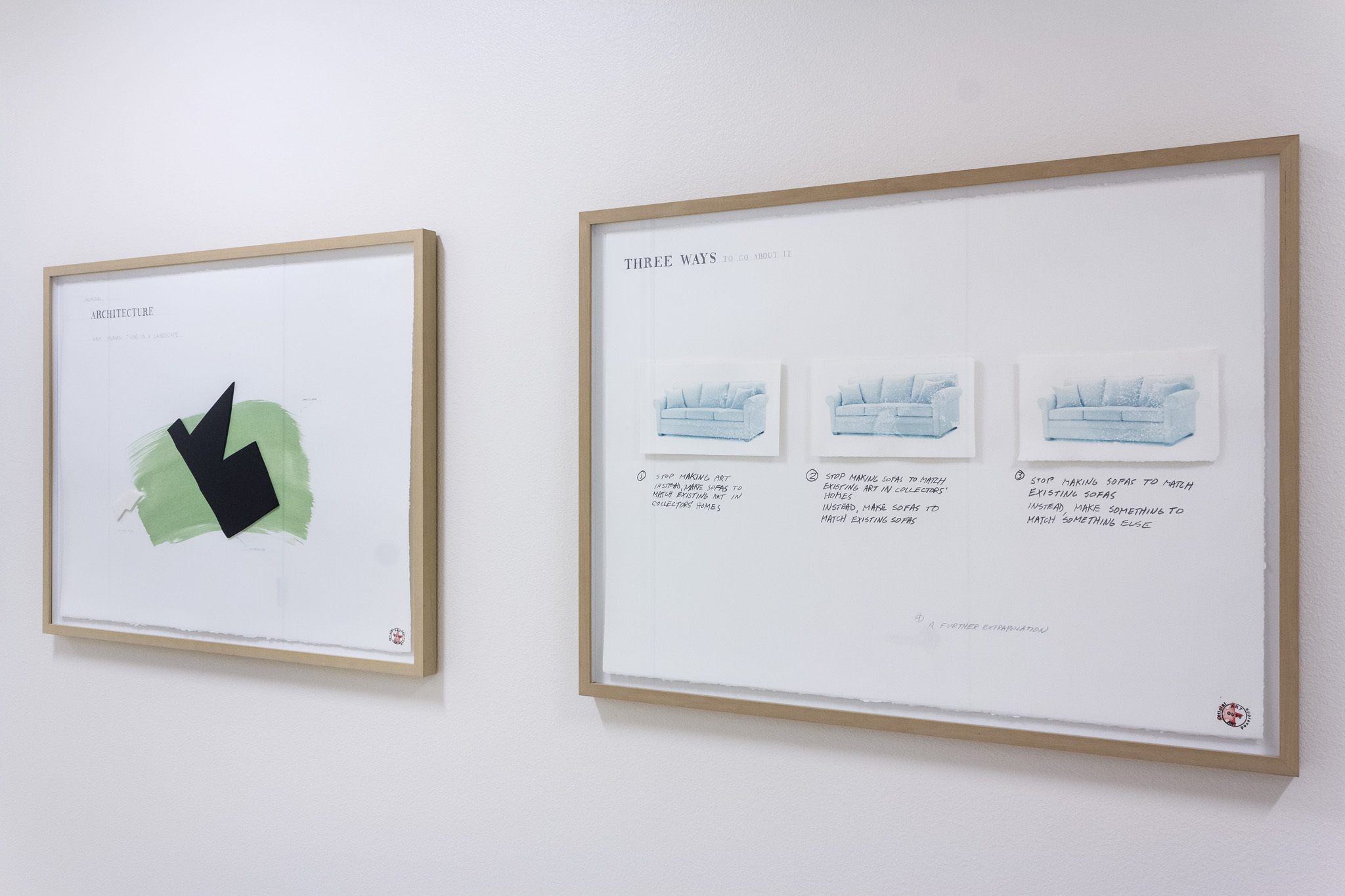
The series of Sculpture Proposals present seemingly mundane objects, architecture, design, or concepts that when viewed as plans for sculpture become absurd. These clever collages seem like more formal iterations of some of their sketches and concept drawings.
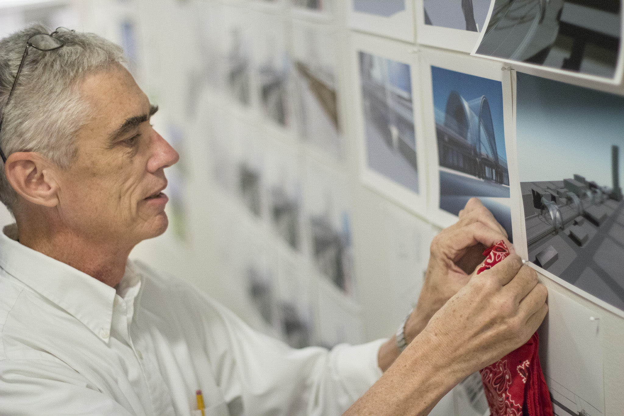
The salon hang of sketches depicting past concepts and unrealized projects casts the brightest light onto The Art Guys’ process. They arrived onsite with boxes of photographs, doodles, and drawings from their archive. Then, the two of them sorted and resorted these items to compose a wall filled with these artifacts. Each one acts as a window into a potential creation. They explain that “all we've got are ideas…. the drawings are a way of recording an idea.” Some are absurd and cerebral and some are blueprints for physical structures yet to be realized. This wall installation, which mirrors many of the design walls throughout Gensler, illustrates how The Art Guys build their bizarre yet captivating body of work.
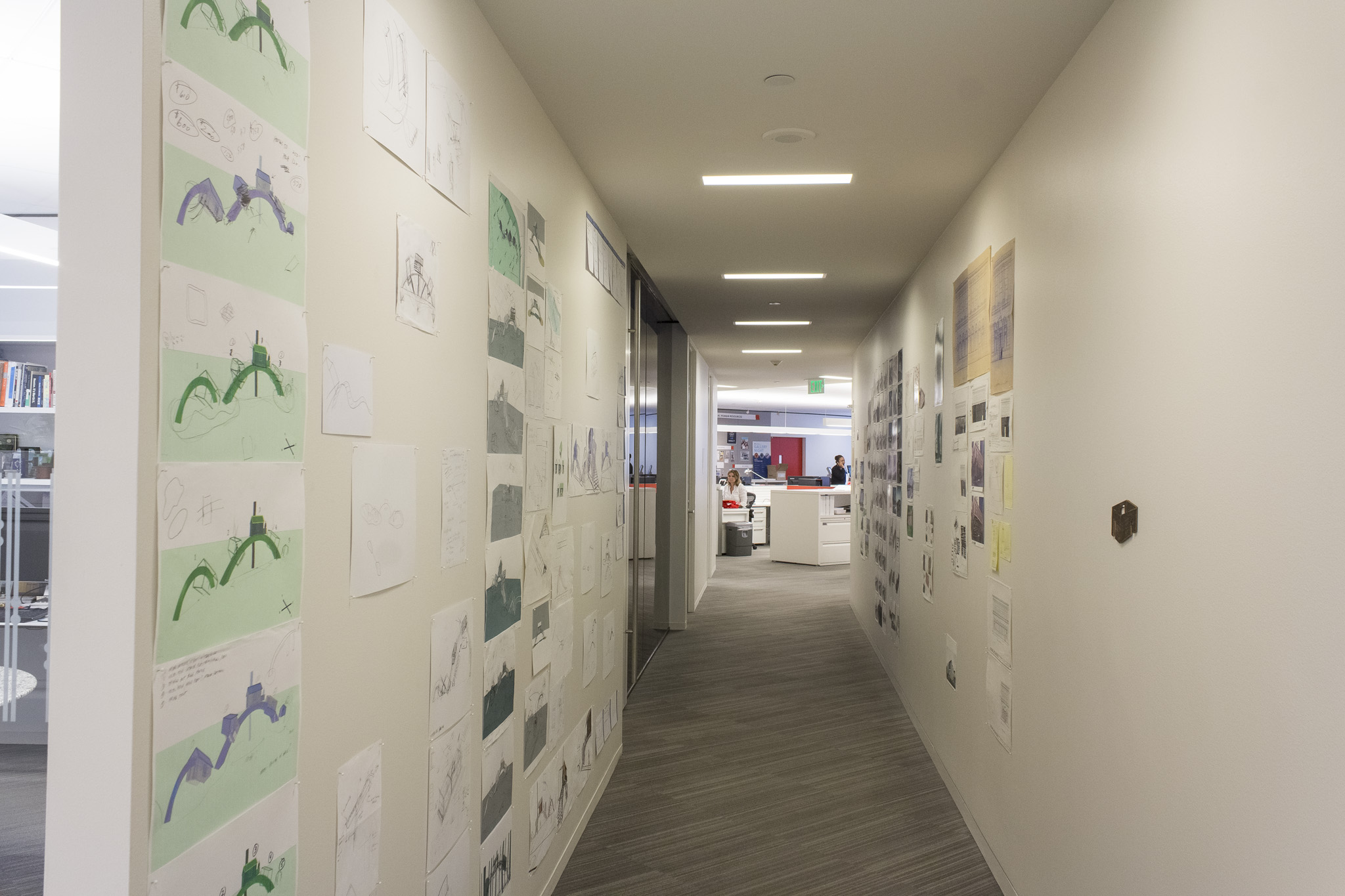
In this unique setting, The Art Guys exhibition addresses key topics relating to architectural structure and design processes that are uniquely relevant to Gensler. They take these core principles and turn them on their head in the hopes of inspiring a reaction or contemplation.
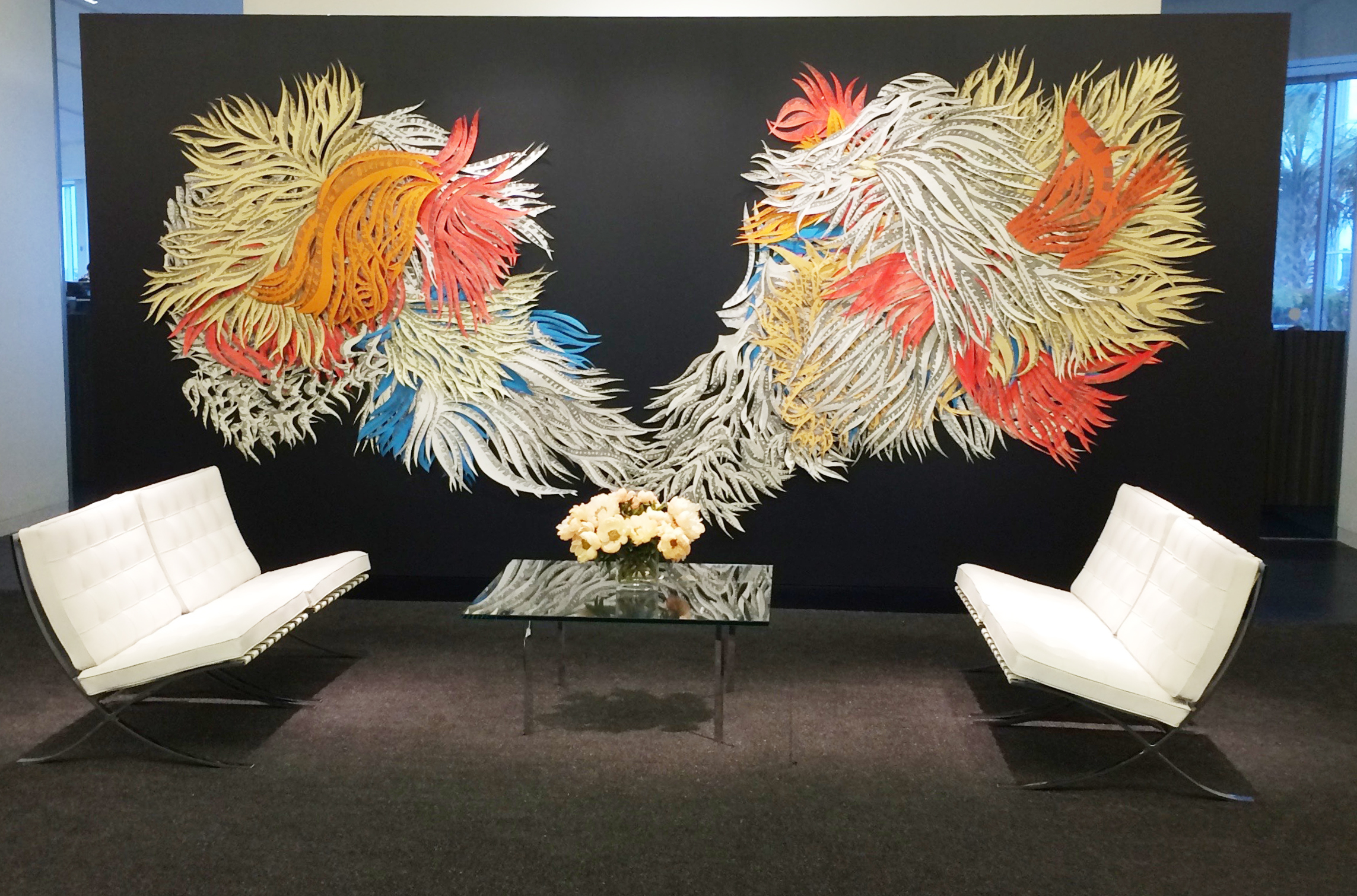
Kinzelman Art Consulting recently organized a temporary exhibition with Houston based artist Natasha Bowdoin at HOK Architect’s crisp and beautiful new space. Bowdoin’s The Daisy Argument Revised is a striking and dynamic spray of feathered elements that recall the aquatic flora of her native Maine. She has installed many iterations of this layered cut paper piece over the years, the first being in 2010.
Professor of Painting and Drawing at Rice University, Bowdoin is known for her painstakingly detailed cut paper installations and collages. Process and content are equally important to Bowdoin in her work. She spends hours hand-cutting the paper elements in direct and visceral response to the even more labor-intensive drawings and transcriptions of significant literary texts. Here the artist has fluidly recorded the text of Lewis Carroll’s Alice’s Adventures in Wonderland and portions of Through the Looking-Glass throughout the abstract composition of the piece.
Natasha Bowdoin’s The Daisy Argument Revised will be on view at HOK through mid-December, 2015.
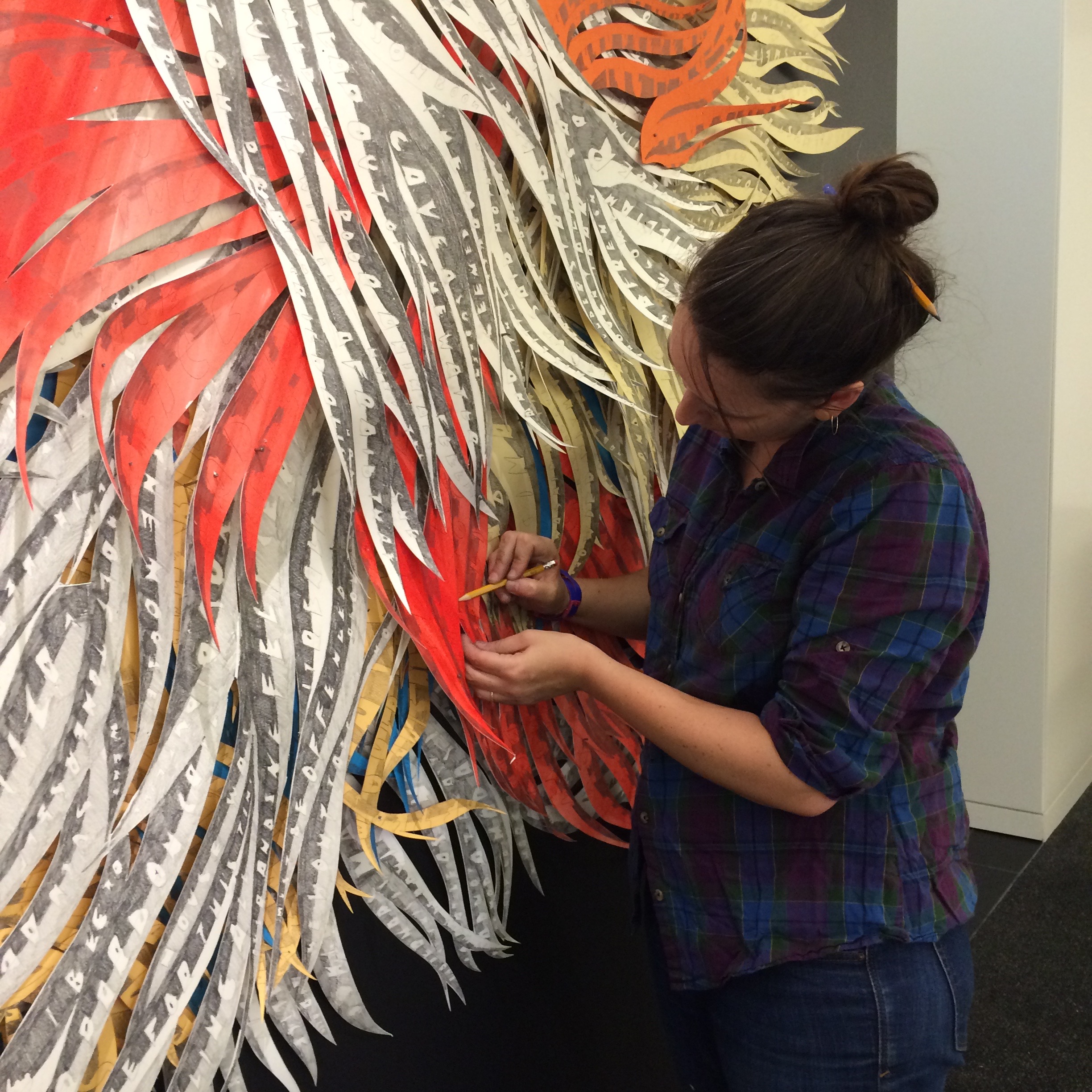
During the installation process, where Natasha intuitively attached individual elements to HOK’s feature reception wall, KAC’s Adrienne Johnson had a conversation with the artist about the piece and about her work in general.
Q: What was the first text you transcribed?
A: Alice’s Adventures in Wonderland. Before, when I first started to use writing in my work it was much more fragmentary. I would transcribe clips of overheard conversation, portions of remembered song lyrics, and bits of my own stream of conscious writing: things that were floating around the studio as I worked. My work is now made up of other authors’ texts. I was drawn to the idea of using others’ writing as a kind of found, raw material, in that it introduced an element into the work and process that wasn’t personal to me and wasn’t something I could predict. This particular piece includes transcriptions of the entirety of Alice’s Adventures in Wonderland, and a portion of Through the Looking-Glass.
Q: How long does it take you to make a piece like this, in its original iteration?
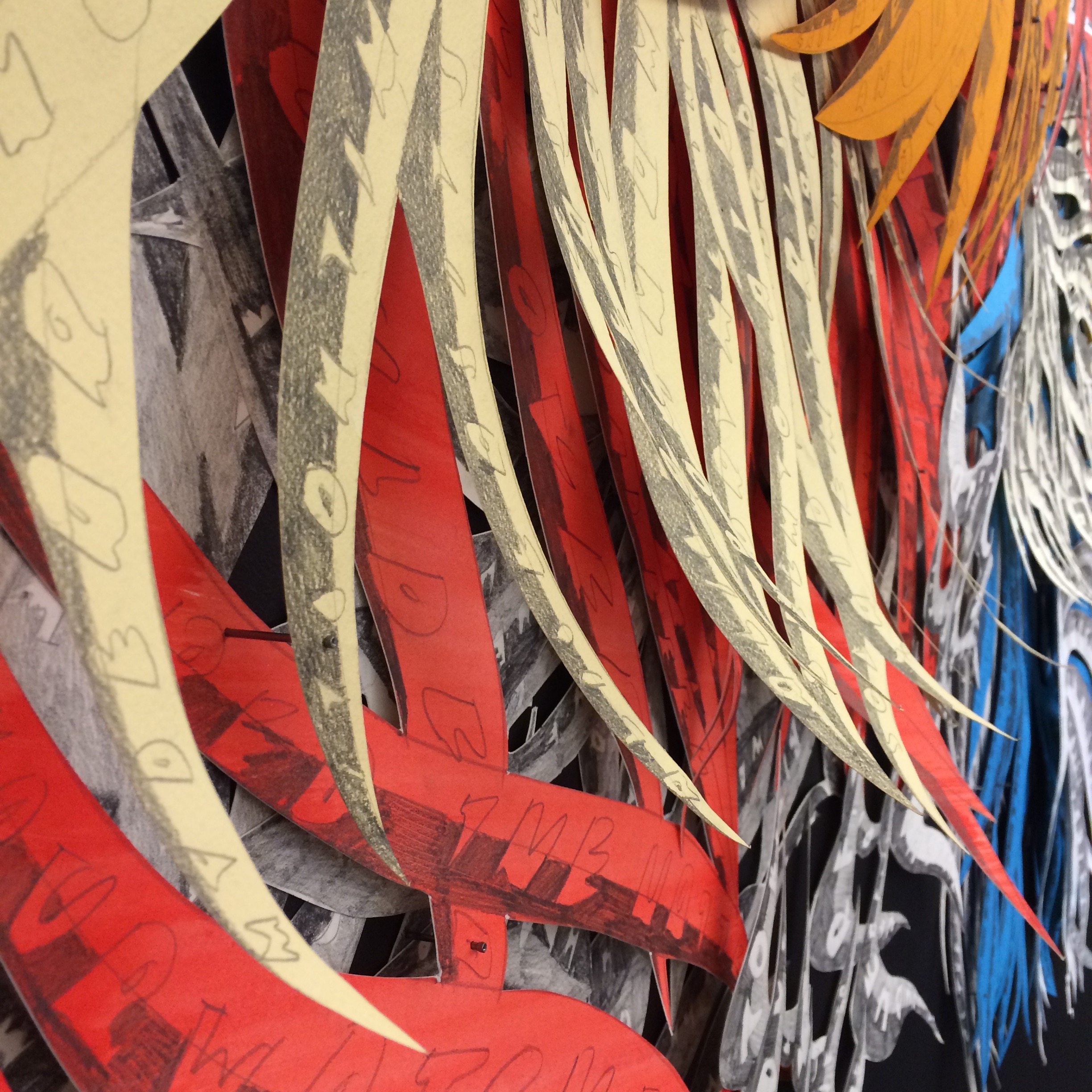
A: This piece in my mind will never be finished. Firstly, I want to complete the transcription of Carroll’s second Alice book. As I mentioned before, I have only partially completed Through the Looking-Glass. Secondly, while at some point the drawings and component parts will be complete, I see this piece staying in flux and transition, resisting any one finite form. The piece is intuitively recombined in each new space it comes to inhabit, never going together the same way twice. Each installation is to a certain extent improvisational. Drawings for a particular installation are usually in the making for several years, as I tend to work on a lot of different pieces at once. If I sat down and focused solely on one installation alone it would come together faster but I like splitting my attention across different works and projects in the studio, in the hopes that different pieces might influence one another in a way I can’t predict.
Q: Is it your intention that viewers read your works?
A: I hope people are neither prevented from reading the work nor feel obligated to. I’m not particularly interested in using text as a means to directly articulate a message or illustrate a meaning. There is a tradition of text in art, established especially in certain kinds of artistic investigation that really took off in the 1960s, that focuses on text as a device for communication or a signifier of meaning. I’m more interested in and inspired by artists like León Ferrari, Robert Smithson, and Mira Schendel, who I think were really interested in the abstract potential of text. People can look for meaning in my drawings, but the structure defies any sense of logic. I don’t give anyone a specific place to begin. Text I think isn’t always straightforward, obvious, or transparent. I like channeling this room for flexibility, ambiguity, and a text’s potential.
Q: Will you tell me about the inspiration for the forms themselves?
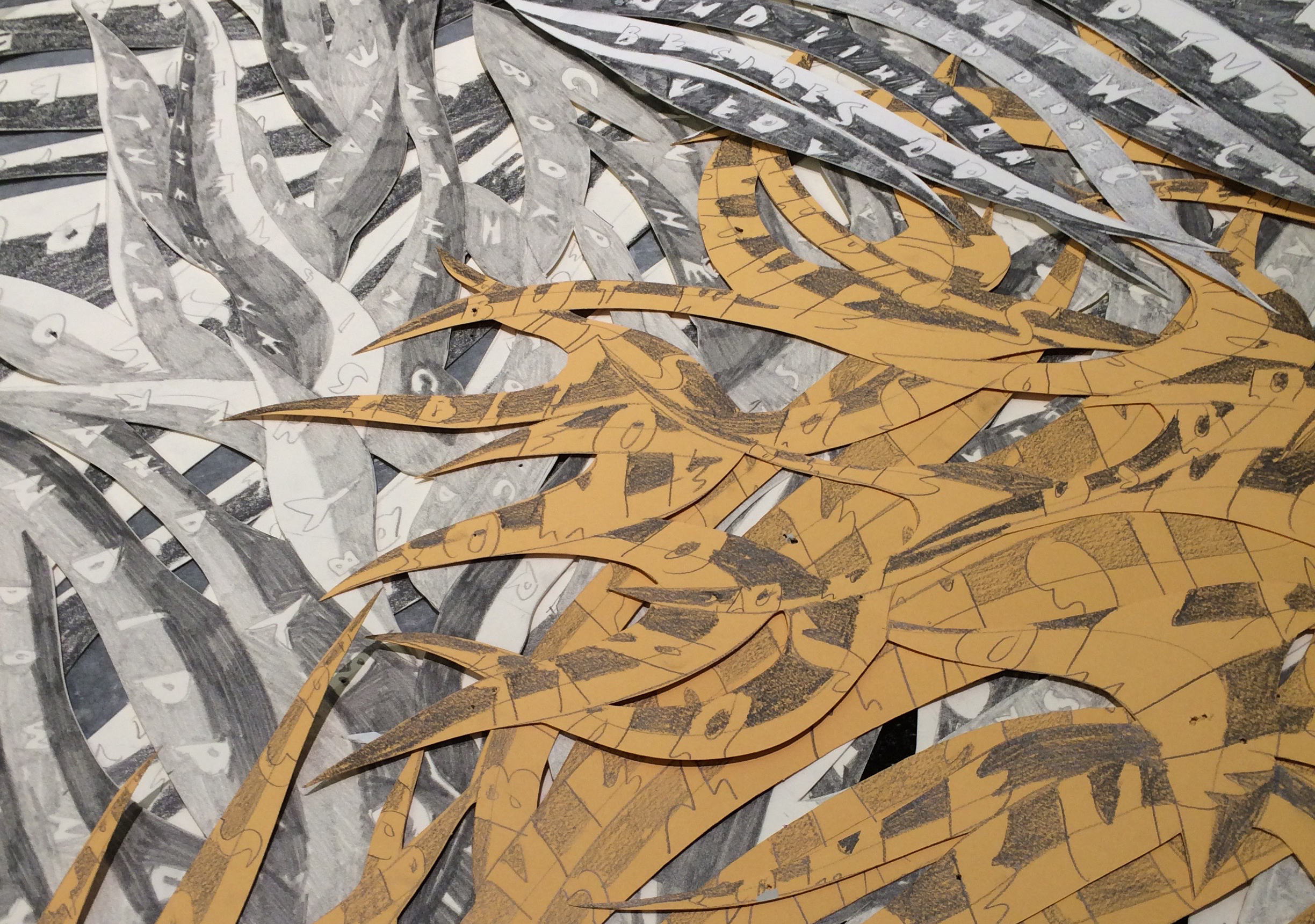
A: A lot of the pattern I gravitate towards as source material is nature based. I’m fascinated with how humans over time have tried to depict and document the world around them. With this piece, I’ve had people tell me that they are reminded of life under the sea, seaweed and sea fans for instance. These weren’t forms I intentionally had in mind but I guess it’s impossible for me to get away from where I grew up. The natural surroundings of my home state of Maine and elements of my upbringing I think work their way into my work subconsciously.
Originally this piece was kept in a palette of black, white, and yellow in that I was thinking of the color of type in a book, and of Alice’s blond hair. Eventually I began to add more and more color in an attempt to reference the wackiness and the vibrancy of Carroll’s Wonderland.
Another reason the work remains in flux is that in a way it’s meant to mirror Alice’s own experience. As she travels through Wonderland she is constantly shrinking or expanding to make her way through the space. There’s a lack of fixed boundary to her own body as she continues on her adventure. This piece is meant to evoke that sense of boundarylessness I find so appealing.
See the installation time-lapse video here:
